All About RGB Working Spaces in General
(Go back to main Profiles page.)
August 16, 2006 (Revised March 7, 2017)
All about them? Well, not really, but I'll have a go at it, with emphasis on my own spaces. Working spaces are a topic that has been able to generate endless discussion (at least during the early days of digital imaging) and I certainly could write about it in a lot of different ways (and have), but here goes.
First a bit on the basics:
RGB working spaces are ICC profiles which encompass a particular region of the CIE XYZ color space (and therefore also the CIE L*a*b* color space). The function of ICC profiles is to establish an equivalence between device color values, such as RGB or CMYK values, and actual colors, as represented by points in one of the CIE spaces. If we then have two ICC profiles, say one for a working space and one for a printer, image files can be converted from one to the other, causing the numbers in the file to change, but keeping the colors looking much the same. This is the core of what color management does.
If an RGB space is designed to encompass a wide region of XYZ space, a given RGB value (such as 255, 0, 0 or any of the other millions of non-neutral values), will correspond to a more saturated color than it would if the space were a smaller one. Remember, RGB values are not colors. Rather they are made from colors when a scanner scans a piece of film or when a digital camera scans a subject, and colors are made from them when they are sent into a monitor or a printer. But which colors correspond to which RGB values? It depends on the device, or in the case of an RGB working space it depends on the design of the space. This makes most RGB working spaces rather like imaginary devices. As a rule, no RGB working spaces or types of devices encompass the same range of colors, though all share the same range of possible RGB combinations (if their bit depth i.e. the fineness of steps within their range of possible colors is the same). The same goes for the CMYK and other device spaces, albeit with a lesser degree of variation between average CMYK device spaces (because so many of those devices are offset lithographic printing presses).
The primary aspect of the design of any RGB working space is the placement of the red, green and blue primaries, as this determines the gamut or range of colors that are included and the precise hue and chroma associated with a given value, although the limitations of Lab space further restrict, in effect, which colors and imaginary colors can be effectively included in a working space to those included within conventionally encoded D50 L*a*b* space. The next most important part of RGB space design is the choice of a tone curve, which determines how the values of RGB correspond to different lightnesses in between black and white. A dark tone curve bunches up the values closer to black, and vice versa. Finally each working space also requires a white point definition to establish the color of white (just as different light sources differ in the color of their light, so do working spaces, though the differences typically remain hidden from the user by automated matching processes between spaces of differing white points).
Now a bit on the typical steps for using working spaces:
The typical way to use an RGB space is to first, either:
In the case of film, convert into the working space from a scanner profile during scanning or after scanning in Photoshop (or a similar app), or
In the case of a digital camera, either (in order of preference): convert into your preferred working space from a camera profile during a RAW conversion in your computer; convert into one of the larger spaces available in the RAW converter and then convert from that space into your preferred working space in Photoshop; or let the camera convert into Adobe RGB or sRGB while making an in-camera JPEG.
Next, edit the image further in an image editing app like Photoshop, with the RGB working space functioning as the source profile during editing, and then finally convert from the working space profile to the printer profile and print. (Often the conversion into printer space is combined with the printing step in a way that may obscure the fact that it's happening.)
If you had a set of my chroma variants, you would convert into the set's master space as described above, and then in Photoshop, at any time during the image editing process, you would assign any of the various chroma variants to the image any number of times, until you were happy with the amount of color in the image, then when the image looks ready to print, convert from the chroma variant to the printer profile as you would from any RGB working space profile, and then print.
In imaging software which supports color management, as most has for years, the image you see on screen is what I call a source simulation, created by using the current source profile for the image (which may be a scanner, digital camera, or working space profile — including chroma variants thereof, or a printer profile if the file has already been converted into printer space) and your monitor profile: i.e. source to monitor. This simulation is being applied to only the image data that is being drawn to the screen, not to the file itself. If you enable a soft proof in Photoshop (View > Proof Setup > Custom..., then enable View > Proof Colors), you see a different simulation, made by using the source profile, the printer (or other output) profile and your monitor profile: i.e. source to printer to monitor. A soft proof can show you the effects of making the image fit into the printer's gamut, which may be negligible or quite large effects, depending on how large the printer's gamut is, how well the printer profile's built-in table maps colors into printer space, and how you've got the soft proofing conversions set up in Proof Setup (e.g. Perceptual with BPC off, Relative Colorimetric with BPC on, etc.).
And now some finer points of selecting and using working spaces:
The most important consideration by far when selecting and using a space is to avoid clipping when the image is converted into it. If an image has colors that would have mapped to values above 255 (to use the 8-bit definition of the maximum value) or below zero in the working space, those values get clipped to 255 or zero, wiping out at least one channel of image in any adjacent pixels so affected. Image detail is basically turned into some shade of colored paint. The way that such out-of-gamut colors are treated when they are mapped into working spaces is worse and more damaging, on average, than the way that out-of-gamut colors are treated when they are mapped into a printer profile. Also, we generally can't know which output spaces we may wish to map a file to in the future. These points are important, because it means that RGB working space design should, by its nature, be much more input-centric, than output-centric.
To restate the above, when a space is designed, the gamut of the colors being mapped into it is more important to take into account than the gamut of the space into which colors will later be mapped for output. Also, it is important that even colors which will ultimately prove to be outside of your printer's gamut are not clipped first (by having entered a too-small working space), because those clipped colors will print worse than they would if merely mapped inward by the printer profile. They will tend to be more lacking in detail and shifted in hue. It's also the case that the working space has to give you room to work — to let you edit your images without clipping them avoidably, although giving yourself too much room to work can also backfire because printer profiles have a hard time moving colors a long ways to bring them into gamut. Care should always be taken to avoid both clipping and pushing colors way too far out of your printers' gamuts.
As digital imaging was beginning to catch fire with a big audience in the mid-1990's, people began to consider the fact that the range of colors that a monitor can show you was smaller in some regions of color (yellows and darker cyans) than what could otherwise be printed on a typical printing press system. And by extension the issue of what you could print on a variety of other, larger gamut digital output devices (the IRIS, the LightJet and so on) was considered. Since monitor RGB was the defacto working space, people began to design working spaces which would at least protect from clipping those colors which could be printed on the various devices. If an input color, say from a color transparency, had been mapped into the working space, but the working space was at least big enough to encompass the gamut of the output device, that seemed like it was adequate protection for the colors in the original. But not to me.
For one thing, I needed a space which would protect my image's actual colors (as scanned from the film or as mapped from the subject when scanning a color negative — digital cameras remained a distant possibility), leaving the colors unmolested, and it was impossible to be sure what the various output gamuts of the future might bring. Besides, as I mentioned, the clipping process when an out-of-gamut color enters a working space, with its simple matrix design (or a table-type working space profile that nevertheless behaves in practice exactly as though it were a matrix-type profile), is brutal and more damaging than what would happen later going into any given printer using the relatively sophisticated tables of the printer profile (at least when assuming a top-notch printer profile). In effect, the question of printable gamut is almost irrelevant when reaching the point of entering the working space, except inasmuch as colors that are way outside of a printer's gamut tend to be mapped poorly even by the tables of a first-rate printer profile.
So I undertook to design Ektachrome Space, J Holmes in September 1997 to safely contain all my image colors as I made fine scans of my film originals, and I have used it ever since (now renamed Chrome Space 100) to excellent effect, and the master files I have stored in it have generally been 24-bit files of over 200MB, derived from 16-bit Heidelberg scanner photomultiplier tube digitization. To the best of my knowledge, this space, and its sister space Ekta Space PS 5, J Holmes, commonly known as Ekta Space, are the first RGB working spaces to ever be input-centric by design. There is a great deal more to the story, however.
To minimize quantization error while storing images in any RGB space, particularly when the data are not 14- to 16-bit per channel, it's a good idea for the space not to be overly large for the image colors that you're putting into it. Think of a color space at a given bit depth as consisting of a 3D region with floating points in it, like stepping stones, where image colors can exist (but not in between). An 8-bit full range of colors in a space has 256 x 256 x256 points floating in space, and so on. Most images tend to occupy a small fraction of the volume of the working space in which they are stored, and if they do clip (hit the walls of the space), it's often just in one or two limited areas and most often in a very light color. Clipping is important to avoid, but it's also quite unappealing to me to put my pictures into spaces which are tremendously larger than the gamut of the colors in the image itself. While it's true that concerns of the quantization error that comes from spaces being overly large essentially vanishes when working with good quality 48-bit files, using a space for a given image which is not far larger than it needs to be protects the quality of 24-bit files in a significant degree and helps out, for example, with underexposed detail from minimally exposed digital capture image detail as well as as with any 8-bit processing bottlenecks. Experiments I have done recently suggest that the deleterious effects of conversion into giant spaces on the number of unique colors present in 24-bit DSLR files is substantial, but tends to be image-dependent. In 3D plots of image colors the increasing quantization gaps between planes of image points is quite marked and obvious, as spaces into which files are converted grow in gamut volume. It's also true, however, that the quantization effects of using larger spaces are hard to see in an image, to the point where they would generally go unnoticed, though the same could be said for any of many other imaging processes which contribute to degradation of image quality, such as less-than ideal scaling/interpolation, noise reduction, sharpening, use of curves, etc., etc!
The tone curve used in the working space also has a substantial effect on the quantization error of the image data, when the data are not in 48-bit form. Assuming the conversion into the space is done with 48-bit data, and then the image is converted down to 24-bits while in the working space, and then converted out to the printer space, it is important for the tone curve of the working space to match that of the printer space relatively well. Since we can't know in advance how a picture may be printed over a long period of time, and therefore what the tone characteristics of the actual printers will be, we should assume that the printers of choice will tend toward the optimal condition that they are perceptually linear in their raw state, and that therefore the tone curves of RGB working spaces should also be perceptually linear. When a printer is well-behaved in this way, a good working space tone curve can save you more than 20 printable levels out of the maximum possible 255, compared to a not-so-good working space tone curve, such as any of the better gamma curves (2.2, 2.0, 1.8).
I have therefore built a new series of five DCam spaces, each of which is very carefully shaped to provide an excellent level of efficiency for holding an appropriate range of colors at a given gamut volume — volumes that one might call very small, large, very large, huge and more-or-less gigantic. The three smaller spaces in the series, DCam 1, DCam 2 and DCam 3 were the most important results of this work and together they comprise a set which covers all of my typical requirements for varying image gamuts. The other two spaces are special-purpose add-ons for times when extra large gamuts may be helpful in a master space. At this point, the major raw converters are all open to using any RGB working spaces of your choosing (at least Adobe's Lightroom and ACR, Iridient Developer and Capture One are, and I think many others, but probably not nearly all).
Check out the many gamut diagrams on Gamut Graphics page. A few more are linked below, one for each DCam space.
The process of finding these new color space boundaries involved making a large number of digitally captured images of a very wide range of strongly and not-so-strongly colored objects and scenes, and then processing them in a variety of ways, then studying the incidence of particular colors in depth, to determine which colors fall where in the CIE spaces and how RAW conversions by leading programs contribute to where subject colors fall. It also required making judgements about which colors are how important for general-purpose working spaces of varying volume. I did thousands of experiments and considered the colors of the world from every angle that I could think of. Having spent, at the time, 38 years as a photographer, dedicated to the technical mastery of imaging, didn't hurt, still, it was a surprisingly difficult task to find this set of optimal gamut boundaries and I learned a lot during the many hundreds of hours that I spent doing it. I think it's fair to say that I covered essentially every kind of color visible in the world, with the sole exception of tropical fish at close range in clear water with good lighting. To this day I wonder, but I would guess that no underwater photographer would find DCam 3 unable to handle fish gamut properly.
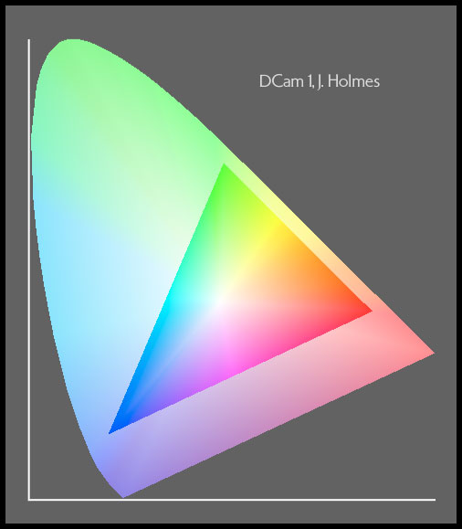
1) DCam 1, J Holmes is over 38% smaller in gamut volume than Adobe RGB (1998) and nearly 11% smaller than sRGB. It is intended only as a specialty space for low or moderate gamut images, which also have near-neutral highlights and shadows, as a way to strongly minimize quantization error for images with relatively little color in them and which may be in 24-bit form at some point while still in the space. DCam 1 will not work well as a general-purpose space if one wishes to avoid clipping. This is an example of an image that easily fits into DCam 1 because its highlights and shadows have little color.
gamut diagram for DCam 1
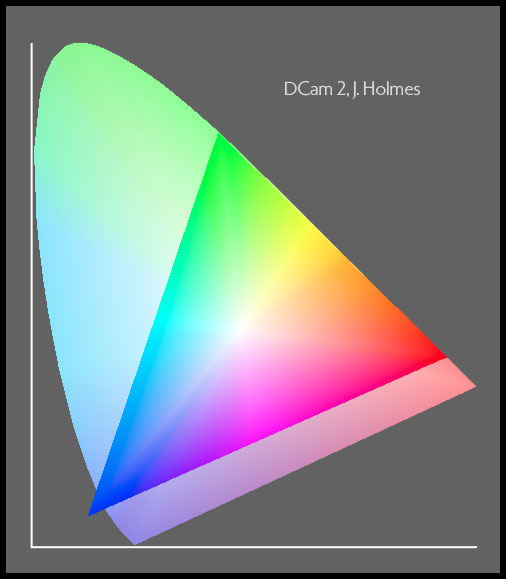
2) DCam 2, J Holmes is 23% bigger in gamut volume than Adobe RGB (1998), exactly double the volume of DCam 1, and much better matched in shape and tonality to the real-world colors apt to appear in digital camera captures than that more-or-less accidental world standard working space. I built this space as a conservative, general-purpose gamut for people who tend to avoid intensely colorful subject matter and/or do carefully literal RAW conversions, rather than ones with color added, or who don't mind a bit of clipping in the most brilliant colors. DCam 2 will hold, in practice, a great deal more useful color than Adobe RGB, probably about 50% more, yet introduce only a little more quantization error to 24-bit data. Ideally this space and the next (DCam 3) would be offered inside of digital cameras as alternatives for storing JPEGs and TIFFs. Both spaces are especially appropriate for 24-bit image data, or data which may at some point be 24-bit while still in the spaces. Also, images in a larger space in 16-bits can be converted into these spaces before converting down to 8-bits without a conversion penalty, if clipping does not occur during the conversion. This is also a viable way to protect your files from some sources of quantization error caused by using an overly large space.
gamut diagram for DCam 2
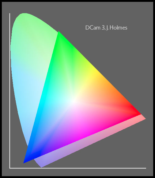
3) DCam 3, J Holmes is 30% larger in net Lab volume than DCam 2, 20% larger in volume than Chrome Space 100, J Holmes (or Ekta Space PS 5), and 61% larger than Adobe RGB. Again, it is much better balanced and matched in 3D shape and tonality to the range of real-world colors apt to appear in digital camera captures or color negative captures than is Adobe RGB. DCam 3 is built as a more forgiving, general-purpose space capable of holding such extreme colors as neon signs, the most brilliant fabrics and foils, and the most brilliant sunset and flower colors with only modest headroom clipping (most of which clipping occurs only when RAW conversion is not done carefully), and moderate quantization error. It is my default recommendation for a general-purpose working space for digital cameras whether for data that will at some point be in 24-bits or for data that will always be in 48-bits while in the space. DCam 4, ProPhoto and DCam 5 are also well-suited for data that will always be in 48-bits though merely being in that form is not in itself any kind of firm guarantee of the coarseness of especially the shadow data/steps.
gamut diagram for DCam 3
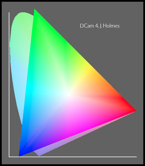
4) DCam 4, J Holmes is 31% larger still in volume (70% over the volume of DCam 2), and about the same volume as Kodak's ProPhoto RGB, encompassing roughly the full range of colors that the widest gamut digital cameras are capable of capturing, including a great many colors that are unlikely to ever appear in actual images (and which may therefore be considered irrelevant for photography). DCam 4 will be most different in use, compared with DCam 3, for the increased headroom it has, which is nevertheless entirely beyond what any printer can print, but which will make it easier to avoid clipping during raw conversion of mainly lighter colors, with hues from pure cyan to green to yellow to red to pure magenta, substantially better than DCam 3, at the cost of further increased quantization error with images in 24-bit form. Images in 48-bit form will be immune from this added quantization damage, so long as they are converted into printer space prior to being converted down to 8-bit form. DCam 4, like ProPhoto, will tend to give you more room than you need, even for brilliant colors, when output requirements, whether to printer or screen, are taken into account. This is especially true when the plus variants of its chroma variant set are employed.
gamut diagram for DCam 4
5) DCam 5, J Holmes is unprecended for the way it encompasses the entire human visual gamut, which conventionally encoded Lab itself does not. (Note that I have only recently discovered that a group in Hollywood had indeed decided to create what is essentially the same color space as a guaranteed way to avoid clipping of real colors by the working space, calling theirs " "). DCam 5's net Lab gamut volume is 25% bigger than that of DCam 4 or ProPhoto, and about 280% bigger than sRGB. It is really huge, and to enclose the visual gamut, it was necessary to use a negative y value, which translates to a negative Y value in the profile itself. If Lab space did not impose limitations on the effective gamut of large spaces, including four of my five spaces, the net Lab gamut volume of DCam 5 would be substantially larger still, but since it does, even though the space itself encompasses the entire visible gamut, some of those colors are not translatable using ICC workflows, including the most saturated greens and yellows that we can visually distinguish. At least all but a tiny sliver of those very intense colors are outside the gamuts of all printers and even outside the gamuts of the currently rare, larger gamut display types (backlit LED, OLED, etc.). The best reason to use DCam 5 may be to avoid clipping during batch conversions of RAW files since it offers tremendous headroom, as can be seen in this illustration, a side view of the five spaces in Yxy space as seen from the yellow side. Take a good look at the tops of the spaces, like little tents, one inside the other.
gamut diagram for DCam 5
All five DCam spaces utilize the ICC standard D50 white point definitions, and they share my unique, proprietary tone curve, which is an excellent match to perceptual linearity and is superior to any gamma curve for preserving image levels when converting into the profiles of well-behaved printers. Gamma curves are too flat near black and tend therefore to cause unnecessary quantization damage to images being converted from a gamma curve working space to a well-behaved printer space. More on this below. Because of this continuity of tone curve shape between all of my spaces, excepting Chrome Space 100, images converted between my spaces suffer low levels of quantization damage from such conversions.
One might think that images in 48-bit form would contain nearly two-to-the-16th power steps in each channel (65,536 levels of intensity in each of the red, green and blue channels), but many come nowhere close to that and may therefore exhibit strong quantization damage in the shadows of the file as it comes out of the RAW converter, though being stored in 16-bit form can help protect such files from further damage, as by being converted into a very large RGB working space or just getting processed in general, because new color values can exist in-between the coarse steps of an 8-bit 3D array. Take a common Canon or Nikon digital camera file of the first ten years of this century in 48-bit form as an example. The 12-bit per channel analog-to-digital converter in the camera takes sensor voltage and equates it with one of two-to-the-twelfth-power numerical values (zero to 4,095) and records this number of steps in what later usually becomes a 16-bit per channel format, but is actually limited to 15-bits per channel in Adobe's "16-bit" files.
The natural tone curve of digital sensors, however, is very different from the natural tone curve of our own eyes. The RGB values coming out of the converter are directly proportional to the number of photons striking the sensor (excluding noise) as a general rule. This means that fully half of the 4,096 possible values from the 12-bit AtoD converter are used for the brightest f-stop of the scale (from just barely blown out, to one f-stop darker in the subject). That's 2,048 steps for stop number one. And stop number two has 1,024 steps. And so on! The Canon cameras of 2006 can actually record an image for just over ten stops of dynamic range in the subject in each channel, but the last three stops of the combined result have serious quality problems. For example, the ninth stop of each channel has just eight steps in it, and the tenth just four (prior to Bayer interpolation or noise reduction processing, which introduce more levels to the file, albeit levels which are not real in the same sense as those actually recorded by the camera)! So if one were to expand, in RAW processing, the image so as to actually make use of these darkest three stops (8, 9 and 10), as you lighten the naturally super-dark image to look about the way we would see the subject, the darker stops will clearly have as few or fewer digital steps of lightness in each channel (on average) as one would expect from a high quality 8-bit per channel file that came from a 16-bit per channel scan of a piece of film. Theoretically, images that are exposed so as to nearly blow out some highlight detail in a digital capture and which are only a few f-stops in the dynamic range of the subject will have no problems with quantization when the files are in 16-bit form, regardless of multiple processing steps taking their toll, but when the scene is more contrasty or the exposure less optimal, we start off with the image being in trouble, quality-wise. I prefer to get the most out of all of my imaging tools and methods — therefore I've settled on using this new quintet of spaces for DCam image storage, each with its own set of chroma variants, as the best solution I can think of for the widely varying needs of just about everybody making digital captures. Another big problem for the quality of shadows from nearly all digital camera captures (some scanning backs are immune to this) is the very large difference between the native white balance of the sensor and daylight, which further reduces the high quality portion of the dynamic range of the camera by causing the green channel to be far more strongly exposed than the red and quite a bit more than the blue, though sensors have made progress on this front too over the last decade, reducing the differences between the sensitivities of the three channels.
Since 2006, things have continued to improve by leaps and bounds, with Sony sensors now boasting up to 15 stops of dynamic range. Having more than 10 stops of good quality information makes the task of recording scenes in color with as much tonal separation as one can actually see without a lot of flare a reality at last. More dynamic range even than our eyes can manage well, more detail than our eyes can see, far better ability to see in the dark, and so on. The foundation for this lies in the fact that sensors can actually capture on the order of half of all the photons landing on them, whereas our eyes can barely manage one percent in the best case scenario of bright (photopic) lighting and even then only in a portion of the green part of the spectrum. Film wasn't much different from our eyes that way, being unable to see more than 99% of the light in most cases. Incredible. Did you ever stop to think then about how many photons there are flying around us every second? As I write this in the bright daylight hours, I figure this room is having about 10 to the 20th power photons fly around and be absorbed every second. ~100,000,000,000,000,000,000 photons. Maybe it's only 10 to the 18th or 19th. Still a lot. We live in an incredibly dense soup of the little things, which to this day have managed to defy complete understanding by physicists. There's a very direct connection between the smallness of atoms and the number of photons. More atoms, more photons. If we see the faint light of a candle at ten miles (about the limits of what we can manage), we're picking up individual photons in a more-or-less one at a time way.
Back to working spaces: remember, the image colors that must fit into the working space are not simply a function of the gamut of the source device (the chemical-based, dye gamut of a transparency, the camera sensor spectral sensitivity-based gamut of a digital camera, or the film spectral sensitivity-based gamut of a color negative), but also a function of the subject matter itself and the ways the film, scanning software or RAW conversion push colors around. Just because a camera or a sheet of film can record a huge gamut doesn't mean it does so when you use it. The world is mainly populated with colors of very low saturation.
On the other hand, it isn't usually the highly saturated colors that get clipped when entering RGB working spaces anyway — it's usually colors of modest saturation that are too light or too dark to fit. They are hitting the roof or the floor of the space not too far from white or black. Unlike Lab space, all RGB working spaces have sloping roofs and sloping floors which fall (or rise) as they move away from white (or black), when modelled in Lab space. Picture a cube balanced on one corner (black) with the opposite corner pointing straight up (white). Note that unlike colors plotted in Lab space, the pointy floor of RGB spaces becomes a flat floor in Yxy projections (a particular way of showing colors in XYZ space), analogous to the way Antarctica and Greenland get really big in Mercator projections, but the ceilings of all RGB spaces are still sloped away from white in Yxy plots.
My current spaces, exclusive of Ekta Space PS5, all use my special, 1024-point, proprietary tone curve which is designed to match the tonality of a perceptually uniform gray scale. The idea is that the more closely the tone scale of your working space matches the tonality of an ideal printer, the better, because the final profile-to-profile conversion into printer space will do the least harm to the image if the two tone curves match. Nearly all other RGB working space designers have seemingly ignored this issue and settled on using gamma curves for their spaces. LStar-RGB is a prominent exception. My original space, Ektachrome Space, was, I believe, the first to fully address it (unbeknownst to me at the time, sRGB partially addressed this issue with its proprietary tone curve, some ten months earlier by using a gamma 2.2 tone curve, which was modified near black). The need to match the tonality of the input space is far less, because typical workflows tend to begin with high bit depth and end with low bit depth because of the great need for higher bit depth to overcome the naturally very dark tone curves of the capturing sensors. So if you want a safe place to keep your digital camera images, but want a giant space to cover the most gamut, you're better off using DCam 4 than Pro Photo, which curiously uses a Gamma 1.8 tone curve, perhaps for the same reason that I used a gamma 2.2 tone curve in Ekta Space PS 5 — because Adobe only supported gamma curves for working spaces in Photoshop 5. Also my proprietary tone curve is a better match to perceptual uniformity than the L* curve used in L-Star RGB, which is too dark, in my opinion at least.
So by creating a beautifully nested (but not concentric) and complementary, five-tier set of spaces just for digital cameras, I believe I have optimized the possibilities for their users — which since 2006 have included myself in a serious way (I had been dabbling for a long time, waiting to see progress that brought digital camera results close to the quality of detail that I got from my view camera. Film results had improved greatly in the years prior to 2006, by the way, thanks mainly to advanced noise removal and sharpening methods that could now be applied to scans of film to remove uniform blurring caused by the film itself and by the limits of the optics used to expose it, but also thanks to solid advances in color accuracy, speed, grain, sharpness, dye stability, and reciprocity failure, not to mention more widespread use of polyester filmbases in place of the really pretty awful cellulose triacetate bases. Take note: All of your cellulose triacetate film will rot within a few decades at room temperature. You will suddenly find that your film smells of acetic acid, is strongly wrinkling and is becoming discolored as anti-halation dyes return to visibility owing to the acid attack. Cold storage or digitization are the only ways to save them. You can read about color storage at www.wilhelm-imaging.com.
While editing an image, the gamut boundaries are likely to become problematic, and colors are likely to clip if you don't keep an eye out for it. Indeed, if no 255's or zeros are present in a file ready for printing, it's likely that it doesn't look as good as it could, but for the most part, clipping should be avoided like the plague until the very end of the editing process. Once clipped, the affected portion of the image is simply gone, replaced with an area of uniform tone in one or more color channels, and it can't be brought back unless the edit is temporary, as in resulting from a layer adjustment. For example, if one increases overall image contrast, as with a typical Levels adjustment, or if one uses a Saturation adjustment in an attempt to control colorfulness, colors are apt to hit the wall(s) of the RGB space (values will reach 255 or zero, in 8-bit parlance). When I clip colors, it is generally the last little push that moves an image from the point where I think it looks just right but a bit flat, to its final state. And I prefer to do any such clipping reversibly, as I continually revisit images looking to get more out of them.
Enter the Chroma Variants (some of this is redundant but it may help clarify some of the ideas to see them restated):
There is a better way to control the dimension of color in digital images than to use conventional RGB saturation tools. Such tools are not only prone to clipping colors, but they simply don't let you adjust the color more than a very little bit without causing so much tonal shifting as to ruin the image. My second major area of development effort with RGB working spaces has been in making what I call chroma variant sets, which are essentially progressively fatter and skinnier versions of a given master space. If one of the chroma variants for a given master profile is assigned in place of the master, e.g. if Chrome 100 JH +12 is assigned in place of Chrome Space 100, the image colors will appear to have changed in both the on-screen simulation and in a print, because the variant will have re-defined the meaning of the RGB values in the file so as to vary the chroma, and the chroma only. It's as though the small universe of the RGB space has simply expanded sideways, along with all the stars inside it (or shrunk sideways when a negative variant is applied), so that no colors ever hit the wall as saturation (chroma) is adjusted.
When a chroma variant set is used to control image color, the issue of the working space not being large enough to encompass all the colors that every printer can print (as for example, Chrome Space 100 and DCam 3 do not encompass the entire gamut possible with EPSON's new UltraChrome K3 inkset) largely vanishes, because the space expands as you push colors outward to the point where you could print those out-of-working space-gamut colors (which didn't exist in the image to begin with) anyway. Again, as a general rule, working spaces should be big enough to contain the source colors, not the output gamut! Changing chroma is a better way to adjust the amount of color, because it is a mathematical model that more closely matches the human sensation of colorfulness than the models used for saturation adjustments in RGB imaging tools, therefore our sense of lightness or luminosity is less affected by changes in chroma than by changes in saturation (a term with a variety of meanings).
It may have occurred to you that this is the opposite of what I explained was the basis for color management in the very first paragraph above. Normally image files are converted from one profile to another, changing the numbers that the file is made of, but keeping the colors the same. In this case, by assigning instead of converting, we are doing the opposite — keeping the values the same but changing the colors by redefining them for conversions to your screen and/or an output space (e.g. a printer).
One philosophy of working spaces would be that each image would have a working space just big enough to hold its colors as it emerges from the scanning software or the RAW converter, plus some more room for later editing. But using a large number of different working spaces (master spaces) would get cumbersome, and the advantages of having smaller spaces for less-colorful original images are certainly small. So I personally have not felt as though I was missing anything by working with my 24-bit scan files from color film (mainly positives), having put them all into the same master space, regardless of the original image content — especially given the superb quality of these 8-bit files, which were all converted from 16-bit scan data and therefore have perfect shadow integrity prior to editing in 8-bit. But then Chrome Space 100, J Holmes isn't what I'd call a huge space, though it's significantly larger than Adobe RGB and is particularly well-suited to use with scans of transparencies. Digital cameras are different though, because their captures can contain a much bigger range of colors than a transparency can, but at the same time their images tend to contain a smaller range of colors.
Chrome Space 100 works pretty well with digital cameras too, but its shape is not specifically optimized for the gamuts of images from digital cameras and it is especially wanting for gamut in the yellow and greenish yellow colors that cameras and the RAW converters are likely to yield from yellow flowers or backlit vegetation, for example. Naturally, each of them needs and deserves its own set of chroma variants. It was not my intention to wind up making hundreds of variants, but things have turned out that way, in the interest of making sure that everybody who might want a set for any of my spaces or for Adobe RGB or ProPhoto could also have a variant set if they wished.
If you use variants from one master profile with an image that's in another master profile/space, the chroma of the image will usually turn out all wrong, inasmuch as the chroma increases will vary a lot by hue, plus the hues will shift around some, and the tone scale will shift if the tone curves of the respective master spaces don't match. In the case of using the Chrome Space 100 set with images in Ekta Spaces PS 5, things often work out beautifully, because those two spaces have precisely the same r, g and b primaries and white point, so the only difference between them is the tone curve. As it happens images in Ekta Space PS 5 get a very nice boost to deep shadow separation by assigning Chrome Space 100 or its variants, so people who've had scans done at service bureaus that use my free Ekta Space PS 5 profile can get some extra deep shadow detail by assigning Chrome Space 100 — often a welcome thing in a scan of a transparency. See this example.
Remember, whatever RGB working space you use, no matter how large, it's always easy to send some colors to the wall with a simple contrast edit, including during scanning or raw conversion. Most cases of colors being out of gamut occur fairly near white or black, not way out in the saturated colors. If a bright, moderately saturated color is a little out of gamut in a smaller space, it's likely to be in gamut with one of the larger spaces, the more so the larger the space is, because most of the "roof" of the space slopes outward at a lower rate, but boost the contrast just a bit more, and it will still clip. Lab itself is flat on top, so one can have colors that are extremely bright and saturated at the same time, but they have no hope of ever fitting into the gamut of any possible printer, display, or RGB working space, so be careful when working in Lab not to let the light colors get too saturated, or the saturated colors get too light!
Really understanding which colors are where, relative to all the gamuts of interest requires that one do a huge number of experiments and little investigations, often using 3D color modelling software, and I regret that I can't show you more than a few drawings of gamuts on my site to explain all of this. Remember that any image that you can actually see on your monitor contains only colors within the monitor's gamut, and four of my five spaces include essentially all of that range plus a great deal more, so illustrating the differences between the spaces on the monitor directly is impossible. One thing you can do though which is very helpful, is to open various images in Photoshop, select a given gamut in your Proof Setup > Custom... dialog, and then enable the gamut warning, to show you which of the source colors in the image (which you may not be able to see unclipped on your monitor) will be clipped going to the chosen output gamut. And you can also choose your monitor profile as your output profile and then see in the gamut warning which source colors your monitor is itself clipping. If you purchase the $30 set of my eight master spaces (the set includes a Monochrome profile too, which shares the same tone curve as most of the rest), you can then run your own clipping tests to see just which colors fit into which spaces, thus helping you to decide which space or spaces are right for you. Still these tests are not necessarily easy to interpret correctly.
(Go back to main Profiles page.)